Details
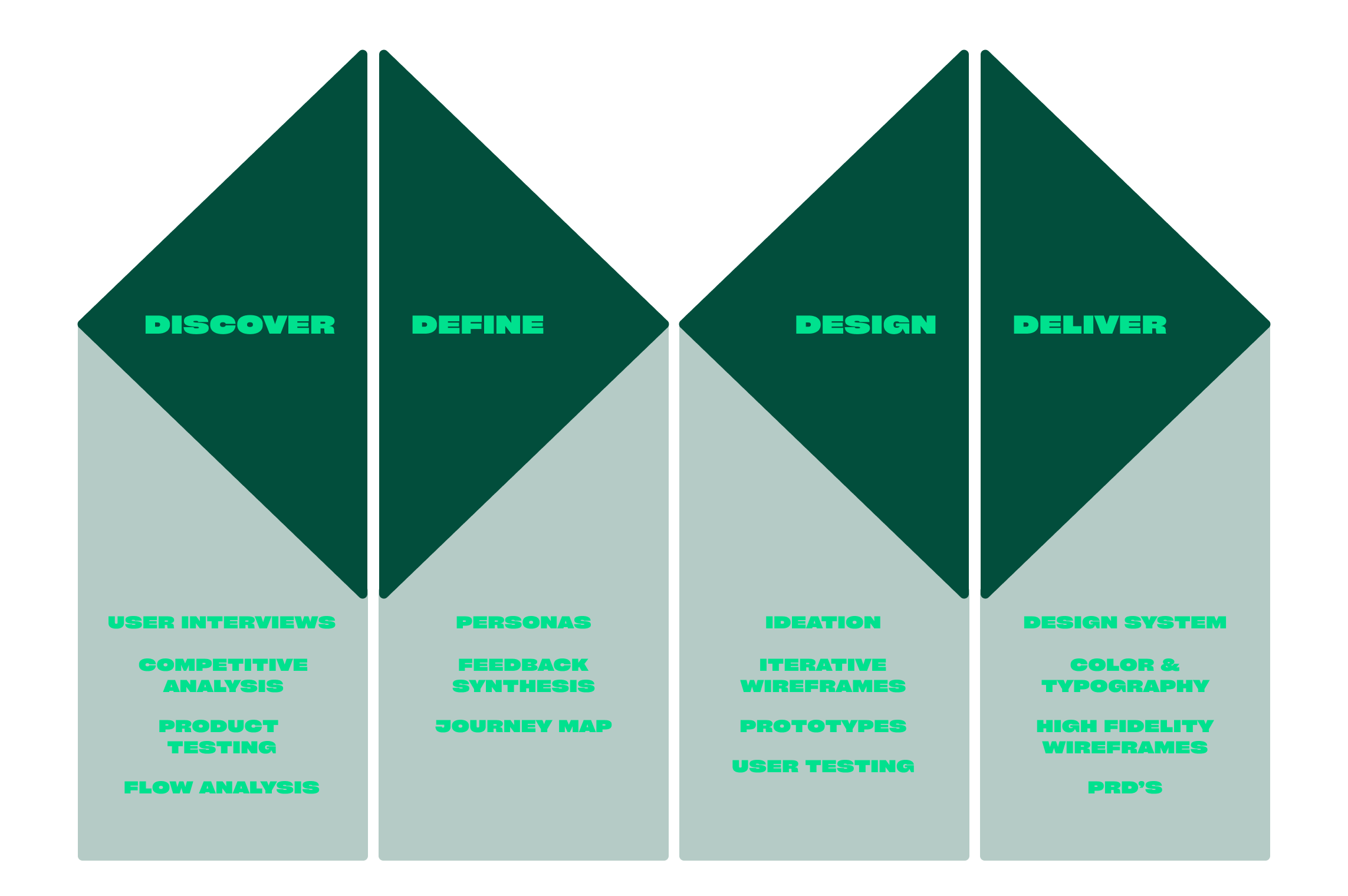
InsuranceMenu is an insurance technology company that offers a SAAS platform for insurance agents and account managers to quote, enroll, and renew their small business clients. As the platform evolved, new features were built without considering the comprehensive platform experience or making changes to the underlying structure of the platform causing a disjointed user experience. Beyond that, the monolith architecture created a significant bottleneck in our development cycle, so a platform redesign was a clear need.